Showing posts with label non-profit branding. Show all posts
Sunday, May 29, 2011 0 comments

Social media management for you by Sarah


Social Media Marketing and Management by Sarah

Picture

Wish you had a way to harness the people power of the social media?

Heard a lot about "like Facebook" and "follow Twitter" but no clue how to get about it, or simply have no time or computer skills?


An early adopter to the Information Superhighway, Sarah has operated websites of many kinds since 1995 -- well before most people -- and began moving into the blogosphere (the world of blogs) in 2003 with her Livejournal and Blogger sites.  Today she is truly a product of social media -- an admitted believer of the potentials of social networking platforms such as Twitter and Facebook -- and tools that make networking easier and pack more impact.

Sarah helps artists, performers, small businesses and community organizations set up their own social media presence in order to facilitate robust and active communications, better transmission of information, announcements and ideas, and build a sense of community and customer loyalty.

And best of all, her rates and fees are affordable and payment terms flexible (within reason).  Basic social media set-up starts at $30 for a one-time session, and ongoing social media management and maintenance are also offered at a great rate and on a pay-as-you-go basis.

Beyond Facebook, LinkedIn and Twitter, Sarah is also well versed in specialized social media sites targeted for particular cultural, linguistic, geographic or industrial groups.  Have you heard of Biznik, Lovli, BrightNeighbor, Living Fusion, Heartbook, Mixi, and Renren?  Let Sarah help your social media presence expand into the uncharted new territories!

Even more so than regular websites, social networking sites are more frequently crawled and indexed by major search engines such as Google and Bing.  Using the techniques known as search engine optimization, she can also turn your social media presence into a magnet for top search results.

For more, contact Sarah online or 503-427-8269.  She can also (of course) be reached on Facebook or on Twitter.


Friday, May 27, 2011 0 comments

Transformation of university branding symbols

During the past decade I have witnessed the trend in Oregon's institutions of higher education.  That is, that universities are reinventing themselves by adopting a new corporate identity strategy that is more in line with those used by businesses.  In the past, those universities had traditional emblems, some with a Latin motto or university name in Latin, some with traditional heraldic devices.  They have used those emblems with pride for decades, attesting to the tradition that a university has built and was founded upon.  At the time, logotypes (i.e., the branding symbol made up primarily with letters) were reserved mostly for community colleges and vocational schools (such as the Portland Community College logo that is clearly a letter P -- and South Seattle Community College where I attended from 1994 to 1997, an image of two books forming a letter S).

Starting in the early 2000s, though, this began to change in Oregon.

First, the University of Oregon jettisoned its original seal with its Latin name, Universitas Oregonensis, and replaced it with the green "O" brand that was designed by the guy who made the Nike swoosh.  Then Portland State University in 2005 ditched the traditional (well, ahem, since the 1950s) and rather artistically pleasing seal with the motto "Doctrina Urbi Serviat" (Let the knowledge serve the city) with the current interlocking "P" and "S" -- the design a certain Vanguard editorialist called "the Girl Scout swastika."  Southeast Portland's Warner Pacific College (whose perhaps most famous alumnus is Mel White), ever undergoing an unending episode of identity crisis, meanwhile changed from the good old "In Christ, Light" seal depicting a biblical oil lamp, to a simple "Warner Pacific" wordmark, then back to a newly designed and short-lived quasi-heraldic seal with a Latin motto loosely translated as "where faith and knowledge lead to service" -- eventually settling with the current green and blue WP logo.  Concordia University Portland also in recent years adopted a simple blue shield with a letter C, after going through a couple of rebranding attempts.

Then this past month, Marylhurst University followed this trend by killing its rather elegant seal (a modernistic adaptation of the university coat-of-arms) and Gill Sans typeface (with which the university motto "Cor Sapientis Quaerit Doctrinam" or "wise heart seeks knowledge" is written) and replaced it with ghastly and visually very discomforting logotype that appears to be a combination of letters M and U.  This one I am quite disturbed by, and hence this article.  Looking closely at the new Marylhurst logo, on one level it is pretty clear that it is a shape of a letter M albeit distorted to a degree; yet on another level mentally it is difficult to make anything out of this.  Is this a curtain hanging sideways from a column?  Is this a desperate attempt at uniting the letters M with U?  It is also too asymmetrical and disproportionate if one is to communicate the letter M, which is by its very nature symmetrical and its aesthetics depend on that symmetry.

This also leads me to a big question -- perhaps related to the changing perception of what a university should be in the 21st century -- of whether such a rebranding effort is necessary for a university, and if so, to what ends.  Universities today, private and public alike, are cash-strapped and students suffer from drastic tuition hikes year after year.  Rebranding costs money for a large corporation and universities are not exceptions.  Some see such rebranding as a good investment to clarify visions for the university and attract students and research grants.  But I tend to see most such branding efforts with invention of a logotype as a cheapening and watering-down of the university's public perception and sense of its purposes.  In recent years more university administrators began seeing their jobs as something along the line of treating their universities as a business -- or a partner with the business sector -- instead of a place for an intellectual inquiry for the truth, and new and deeper knowledge.  Marketing campaigns to attract new students are becoming so banalized and even infantile that it is no longer sure whether universities are becoming a Club Med for young adults or else another glorified vo-tech school.  The bigger victim of this rebranding is also the tradition that the university possesses -- and betrayal of its alumni and long-time professors who built that tradition.

This is not to say rebranding is per se a bad idea for a university.  But it must be done in such a way that is appropriate for an institution of higher learning.  Unfortunately new logotypes do not easily communicate the nature and missions of a university.  Interestingly, too, is that universities and colleges that are rebranding were generally founded during the mid-20th century.  Maybe they are going through a kind of identity crisis like an adolescent.  I cannot imagine older institutions rebranding this way.  It would be a bad day when the Oxford University decided to adopt a big-X-inside-an-O logo!

This also serves as a reminder that not every organization should brand itself with a logo.  There are other symbols that can communicate its missions better.

In fact, one of the better rebranding efforts by Oregon's universities is that of the Pacific University.  Instead of creating another run-of-the-mill logo, Pacific U. came up with a stylized symbol deriving from its heraldry, a lion rampant.  It is at the same time reasonably post-modern, simple to reproduce, visually pleasing, while also communicating the sense of tradition (the lion rampant often recalls the image of the British monarchy or other traditional institutions).  Similar approaches have been taken by the Government of Singapore and also by the Hong Kong Special Administrative Region Government when they created their "Brand Singapore" and "Brand HK" respectively (as both Singapore and Hong Kong prohibits non-government entities from using their heraldic emblems, the "Brand" allows for an alternative that can be used by private businesses and tourism industry).  Singapore's brand features a stylized portrait of a lion (Singapore, or Singa Pura in Bahasa Malaysia, means "city of lion."), while the Brand HK is a stylized dragon (the dragon is from the pre-1997 coat-of-arms of the Crown Colony of Hong Kong, though the post-1997 government emblem and the flag depicts the Blake Bauhinia flower) with a slogan "Asia's World City, HONG KONG."

Wednesday, March 10, 2010 1 comments

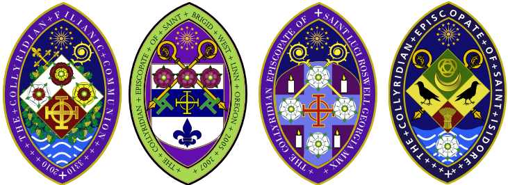
Heraldry and ecclesiastical seals: where high-tech contemporary designs meet time-steeped tradition

One of my specialty areas of practice is designs of traditional ecclesiastical (church) seals that both follow the centuries-old traditions of heraldry that are rich in metaphorical and spiritual symbolism, and at the same time stylish and visually pleasing to the contemporary sensibility.


Read the stories behind these seals, including their heraldic symbolism and meanings.
 
;