Tuesday, June 21, 2011 0 comments

Free clip art: Cat in a paper bag


Download SVG file
License term: Creative Commons Public License 3.0 by-nc-sa.

Creative Commons License
Cat out of the bag by Sarah Morrigan is licensed under a Creative Commons Attribution-NonCommercial-ShareAlike 3.0 Unported License.
Enhanced by Zemanta
Monday, June 20, 2011 0 comments

Interesting...


The latest site stats.  Iran, 13.  Macau, 2.  Russia, 2.  Ukraine, 1.
Saturday, June 11, 2011 0 comments

Fire and Water


0 comments

Field art at the frontline of struggle

Letter from the 1909 Rose Festival in Portland...Image via WikipediaIn Portland, Oregon, thousands of un-housed individuals are constantly persecuted and attacked by local police, rent-a-cops hired by the businesses, and by random thugs, for the crime of attempting to survive.  Especially during the weeks preceding the Portland Rose Festival, "the official festival of Portland," the police is busy driving camps out of the Tom McCall Waterfront Park, under the bridges and other prominent downtown locations, utilizing the city ordinance prohibiting camping on public right-of-way.

This year, local activist organizations Right 2 Survive, Dignity Village, and Sisters Of The Road, as well as representatives from Seattle's SHARE/WHEEL have set up an impressive camp-out gathering that is a cross between a protest, a block-party, and a mini-Rainbow Gathering, on the sidewalks of Southwest Fourth Avenue between Alder and Stark Streets.  This is done in response to the long-standing tradition (and now officially codified in the city ordinance 14A.55.010.C) that allows the parade spectators to camp overnight on public sidewalks starting on Thursday before the Grand Floral Parade on Saturday morning.

In solidarity and honour of this direct action, I have created an acrylic painting (aptly titled "Right to Survive") depicting the street camp and demonstration at the intersection of Fourth and Washington.  It is presently on display on the exterior wall of the former Greek Cucina site, on the southwest corner of the intersection.  It should be up until the parade, which is scheduled to start at 10 a.m. (allow 30 to 45 minutes before the first float arrives at the intersection, from the Portland Veterans' Memorial Coliseum via Grand Avenue and Burnside Bridge.

Related articles:


Enhanced by Zemanta
Wednesday, June 8, 2011 0 comments

Road Markings (2011) Mixed-Media (mandala)


Project Credits:

Participants


Cole Merkel 马凯龙
Darren Alexander         艾达仁
Ray
John Brown
Gary Davis 邓介历
Troy Ennis 恩德勒
Spence 石鹏史
Terris Herned         韩泰伦
Saul Cortez 高世武
Two Bears
Roger Fuch 方禄基
Benjamin Matthews        麦贲锦
Julia Munson 闵珠丽
Bergen Allee 李凤佳

Project Sponsor: Operation Nightwatch Portland
Event Sponsor: Lake Oswego United Church of Christ

Project lead and conceptions: Sarah-Andrea Morrigan  柳彩云

Enhanced by Zemanta
Monday, June 6, 2011 0 comments

Phoenix

Photograph by Sarah Morrigan
0 comments

Hello from scenic Molalla

Map of Oregon highlighting Clackamas CountyImage via Wikipedia
I am typing this from the forest of Clackamas County, at the Camp Adams.
Enhanced by Zemanta
Sunday, June 5, 2011 0 comments

Constructing an artmaking ritual as social and spiritual practices (part 3)


Construction of a ceremonial artmaking as a social and spiritual practice
Sarah-Andrea Morrigan


Background for this project: In 2008, I began serving as the artist-in-residence for the annual Operation Nightwatch (Portland, OR) spiritual retreat in rural Clackamas County, Oregon.  The annual event, an invitation-only affair with a group of between 10 to 20 pre-screened participants, brings together various kinds of people for whom any similar event held elsewhere would be economically prohibitive.  Built upon the regular client base of Operation Nightwatch, this includes individuals in various stages of recovery, those living with non-mainstream mental diversity, and severe socio-economical challenges.  Since 2008, I had worked on the improvement of existing art-and-craft programming during the event by inspiring and providing infrastructure for creativity.  A well-stocked ad hoc open art studio is established each year through the duration of the event in the conspicuous common area to allow a free-flowing and open-ended artistic expressions and experimentation by participants.  I had also made conscious efforts at improving the artistic quality of the group project, as the product of the group project has traditionally been on permanent display and I felt that many of the previous years’ group projects appeared infantile and reflected low expectations placed by facilitators of participants, thus unduly underestimating their values as creative adults with a real life.


Challenges:
The past year’s project began incorporating the interactive social practice aspect of artmaking (making art as a conversation), but it did not produce a sense of community -- in fact, a certain person had vandalized the creations of other participants while no one else was watching!
In the effort at making it free-flowing and open-ended, the quality of the artwork suffered accordingly, and was far from complete when the retreat was about to be over.
This format came originally as a response to feedback that participants were being hurried endlessly from one activity to another and did not have mental space to take in the nature and the retreat’s themes.  How can we make a great art together, and have a great fun at it, and yet derive some serious spiritual meanings out of the activity, consistent with the overall theme of the spiritual retreat -- all without anyone feeling like they are treated like little children in a boring art-and-craft class being told by a teacher what to do?


Solutions:
While I am primarily a visual artist, art is more than visual and encompasses all modalities.  As a social art, each participant brings his or her own talents, personalities, and creative modalities to the mix.  Hence the project is no longer limited to visual art or specific methods, but rather incorporates a little bit of everything -- including performing art elements.
Taking the spiritual themes of the overall event as the point of departure, I had constructed the project to elicit creations of spiritual significances by participants.  This is accomplished through a ceremonial format.
The ceremony is constructed deliberately to be in keeping with the ecumenical nature of the organization with “no proselytizing policy” in place.  Instead of using the “lowest common denominator” (which usually involves a scaled down, minimalist Protestant Christian practice), however, I had taken the entire ceremony outside what may be familiar to the participants.  This is done for a number of reasons: (1) A retreat is a time outside the ordinary by design, and creating an environment that is outside the routines and the familiar is rather appropriate; (2) This way, I would not need to privilege a predominant (or any specific) faith tradition over the others -- in the rituals invocations are made to “Lushede” (from the La’adan language) to emphasize the all-inclusion in neutrality; (3) and thirdly, I hoped that this project will not only be multimodal and mixed-media, but also multicultural.  The ceremonies are generally constructed along the lines of shamanic rituals of the historic pan-Tungusic nations (eastern Siberia, Mongolia, Manchuria, Korea and Japan), with some input from the Chinese Buddhist and Daoist elements, as well as some parallels in the Native American rituals.
The all-encompassing ritual environment facilitates participation without making it feel like a compulsory “art class” or “craft activities” of the past.  Fully incorporated with the Exploration sessions of the retreat, participants can bring whatever the feelings into the ceremonial art while can also derive personalized meanings from the experience.  Likewise, the ritual elements create a special time and space within the event where certain intentions are held in common as a group.


The Art Project: Road Markings (2011, mixed-media, 18 inches x 18 inches) 
This year, in favour of enhancing the shared social elements of artmaking -- and in recognition that each person comes with a varied artistic skills and creative temperaments -- less emphasis is made on the visual media or development of skills.  The actual artmaking, heavily ritualized, is rather simple and easy for most people, involving a form of East Asian calligraphy (without needs for learning any language).


The panel is accented with a small canvas board painting representing the four cardinal directions according to the Chinese tradition: black turtle (xuanwu) of the north, blue dragon (qinglong) of the east, red phoenix (zhuque) of the south, and white tiger (baihu) of the west -- signifying that the the artwork represents the world in which we live. 


At the centre is a circular mandala made of paper leaves in various shades of green.  The leaves grow outward in a radial movement, representing the reaches of the world tree from the axis mundi that connects the heavens and the underworld with the earthly plane.


Upon the leaves are a spiral line, originating from the periphery extending inward into the centre of the circle.  During the ceremony, Chinese calligraphy brushes are passed around, and each participant may write words or ideas representing what they believe is the truths about who they are.  Outside the circle are straight lines, upon which what they believe is the falsehoods about who they are is written.  The spiral shape of the lines of personal truths also symbolizes a kind of pilgrimage, on which a person undertakes to take leave of the falsehood and into the ultimate truth, while discovering more and more about what is real and what reflects their own divine images.


Saturday, June 4, 2011 0 comments

Does anyone know whatever happened of her?

Once upon a time, God lived in and among us the Portlanders.

http://portlandtribune.com/news/story.php?story_id=27234
Enhanced by Zemanta
0 comments

In honour of a nation history has forgotten


The word "Manju" (Manchu) written in...Image via WikipediaManchuria was home to various Tungusic ethnic groups, whose languages were more in common with Mongolian, Japanese and Korean, and with them shared a long tradition of shamanism.  Like the Mongols, at one point the Manchus became powerful and took over China, ruling over the Han and other ethnic groups for centuries.

At the collapse of the Qing Dynasty and beginning of the Republic of China (Xinhai Revolution, of Dr. Sun Yat-Sen), the Manchu people founded a separate country under the leadership of His Imperial Majesty Aisin-Gioro Puyi and with support of Japan, who had an interest in securing the strategic natural resources and railroads away from invasions of the nascent Soviet Union, and to have a buffer zone for Japan against the Bolsheviks.  The newly reorganized Manchuria quickly became the most ethnically diverse nation in Asia, with Japanese migrant farmers, White Russians who fled the Soviet revolution, Koreans, Han Chinese, Chinese Muslims, living side-by-side with the ethnic Manchu people.

The economy and currency of Manchuria at the time was considered most sound and stable in the region, only next to those of Japan.

In 1945, the Soviet Union invaded Manchuria -- and shortly after the surrender of Japan to the Allied Forces, the Russians unilaterally handed Manchuria over to Mao Zedong's Communist Party.  Thus the nation was quickly forgotten except as a "fake (puppet) Manchukuo" that is occasionally mentioned in history books.  The cultures, spiritual heritage and language of the Manchus were all but destroyed.

There is however an effort to revive Manchuria.  Recently His Imperial Majesty Lee Chee Chuan, a direct descendant of the Tang imperial family who had been exiled to Malaysia, assumed his throne as the emperor of Manchuria (on May 28, 2011).


Enhanced by Zemanta
0 comments

Speaking of cartography

A sign at the international boundary between C...Image via Wikipedia
Maps, just like history, are inherently biased and are outdated the moment they are printed.  We live in a dynamic world, with people with varying perspectives, and therefore a map does not convey an objective truth -- even if it might represent a widespread consensus.  The existence of international boundaries and its highly arbitrary and political nature is an epitome of this phenomenon.  We have the earth and its natural phenomena.  We then have a map of the world, neatly divided into various coloured zones.


Somewhere between the yellow sign (in Tsawwassen, BC) and the street sign (Roosevelt Way, Point Roberts, WA) is the U.S.-Canada border.
Look at the ditch on the right.  It is a border. (0 Avenue, Surrey, B.C., just a few metres east of the Smugglers' Inn, Blaine, Wash.)


The yellow concrete marks the end of Canada, while the USA welcomes neighbourhood walkers into the park with the sign "scoop your doggie poop." (On Peace Park Drive, Surrey, B.C., looking towards Peace Arch State Park, Blaine, Wash.)


On the ground level, such borders can defy the reality and may even be really silly, especially in case of the U.S. and Canada.


Enhanced by Zemanta
0 comments

Re-packaging oppression: What do you think?

2008 Dodge Charger police cruiserImage via Wikipedia
The Portland Police Bureau just unveiled the redesign of its squad cars, with a nod to Portland's love for social media, featuring its Twitter handle where it would have conventionally had something like "Call 911." (This probably does not, however, mean that the dispatchers will respond to DMs.)

Sometimes rebranding and repackaging are done to present a "new image" after a series of scandals or publicity nightmares.  The Portland Police has suffered from a series of PR problems for years, from the allegations of sexism, homophobia, transphobia, and string of murders of the mentally ill people and those without housing.

It is quite telling that the PPB decided to put the slogan, "sworn to protect, dedicated to serve" back on the cars.  What is not explicit is that the police is there to protect and serve the interests of those who help elect the mayor into office, not the interests of those whom the same special interest groups marginalize.  The sight of a police squad car slowly cruising through downtown streets and parks causes discomfort and fear among the homeless population, while the presence of this same car makes the upper-middle-class business executives walking through downtown to a power lunch meeting and tourists who are about to dump hundreds of dollars into Portland's economy "feel safe."


Enhanced by Zemanta
0 comments

Portland Pioneer Courthouse Square: On invasion of Taiwan and Sakhalin by Japan!

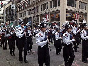
The three parades of the annual Portland Rose ...Image via WikipediaThis post has been merged with http://iriscatartanddesigns.blogspot.com/2011/06/diplomatic-nightmare-at-pioneer.html as of Sunday, June 5.
Enhanced by Zemanta
Friday, June 3, 2011 0 comments

Re-branding poverty: distraction, sugar-coating, or...?

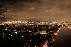
Portland Oregon night vistaImage by violet sugar via FlickrYesterday, Portland opened the gates of the brand-new Bud Clark Commons, a multipurpose building that occupies a half-block area between the main post office and the Greyhound station that now houses a 150-unit apartment complex, "Doreen's Place" men's shelter, and the new Transition Projects (TPI) day resource access and homeless control facility.  The idea came during the Tom Potter era when the Multnomah County circuit court ruled that the sit-lie ordinance would be unconstitutional, and simultaneously the city was under fire from the local business community for its seeming molly-coddling of the vagrants who were taking up too much sidewalk spaces and bothering shoppers, convention delegates, and tourists.  For the past several years, the Julia West House, a small building owned by First Presbyterian Church in West End district, served as an interim day access center until the completion of the Bud Clark Commons.

Along with the opening of the Bud Clark Commons, inevitably quite a bit of graphic design and branding work (and most likely more than a few focus group sessions) into branding both Bud Clark and the Housing Authority of Portland, the manager of the apartments section.


The Bud Clark Commons logo is essentially a sampling of the eight shades of green used throughout the building.  As you see, the scheme of the building, both exterior and interior, features wood panels accented with green window panes, green furniture, and green fixtures.  The visual effect is to evoke the imagery of a tree, with its diverse shades of green, true to Portland's proximity to forests and the city's commitment and reputation as a "green city." (The building, needless to say, is LEED Platinum certified!)


Using this as an opportunity, the Housing Authority of Portland also unveiled its new corporate identity.  Now HAP is known as Home Forward.  The press release proclaims: "the vivid blue, green and featuring a 'flourishing home' symbol that combines the two colors, the new identity tells the current and future residents... that Home Forward is a progressive, positive enterprise committed to a better tomorrow."  The design was made by Bill Chiaravalle's (author of Branding for Dummies) Brand Navigation (an Oregon company based in Bend).

These are great designs, and as a graphic designer, I commend their efforts.  I hope the new branding would not only better communicate its missions and visions, but also make the services more accessible and approachable.  I believe also that these new, sleek designs will help destigmatize the services and their clients alike.

However, as a social justice advocate, I also find at another level these rebranding campaigns somewhat troubling.  The less desirable side-effect of this is that it will sugar-coat poverty and the systemic injustice that dehumanize the poor.  Just like silly euphemisms often used in relation to the same population (for instance, many shelters call their clients "guests" instead of just bums, as though they are a five-star hotel; yet it is the underlying attitudes, reinforcement of social boundaries, paternalism and radical separations, and dehumanization of the poor by the privileged population that are left unchallenged), it plays down the severity of the life under poverty and helps those with privilege to not feel too guilty for perpetuating the evil.  In this sense, the nice and pretty buildings distract the wider community from the fundamental problems and sterilizes the reality of poverty behind the architectural and branding aesthetics.
Enhanced by Zemanta
Thursday, June 2, 2011 0 comments

Diplomatic nightmare at the Pioneer Courthouse Square

The flag of the city of Portland, Oregon flyin...Image via WikipediaAlmost every world-class city has its city square, and Portland is no exception.  Presently, the Portland Rose Festival -- the "official festival of Portland, Oregon" is under way and is drawing tourists from everywhere.  So is the Pioneer Courthouse Square, "Portland's living room."


The local artist Bill Will has designed an impressive display of flowers in a world map formation, for the Portland Rose Festival's "Festival of Flowers" at the Pioneer Courthouse Square.

But the unintentional error on the artist might provoke some unpleasant diplomatic snafu as the Pioneer Courthouse Square, "Portland's living room," continues to draw Chinese and Russian tourists.


This year, the annual Pioneer Courthouse Square display of flowers features a large map of the world, with each country represented by a flower.  For instance, purple flowers for the United States of America, red for Mexico, and yellow for Canada.

Perhaps the designers of this display, not surprising given the low geographical literacy of Americans, did not intend to make a series of errors that might earn the wraths of some diplomatic officials abroad.

Take a stroll down to the Pioneer Courthouse Square and look closely to the eastern end of the display.  Japan is represented by green, bamboo-like plants -- with a rather amazing accuracy of shape (sans Shikoku).  Look towards the south.  Here is Taiwan in green -- with the same type of plants, while the People's Republic of China is red.  Look north of Hokkaido: the island of Sakhalin, now an oblast of Russia, is also green!  What is up with this picture?  Apparently, the creator of this display is stuck in the pre-1945 world geography class, when Japan did indeed own both Sakhalin (Karafuto) and Taiwan.  (Well, Japan did occupy Korea, too -- but the floral map accurately paints Korea with two different colours, purple for the Democratic People's Republic of Korea and orange for south Korea).

As an official Rose Festival sanctioned event, this is a possible diplomatic irritant.  The Chinese diplomat would be non-plussed by the apparent occupation of Taiwan, which China claims to be part of its inalienable territory, by Japan.  The Russians would not be happy to see one of its major islands being mistaken for a Japanese territory (in fact, in prior to 1945, only the southern half of Sakhalin was Japan). And most Taiwanese residents want Taiwan to be either Chinese or independent (with small fringe exceptions).

Fail!

UPDATES! (June 11): I note that the Sakhalin island has morphed into Hokkaido, while the previous Hokkaido has been absorbed into Honshu, making the Tohoku region somewhat elongated.  Taiwan still belongs to Japan.

UPDATES! (June 11): Why is Sinai Peninsula given away to Jordan?  It is actually Egypt.
Enhanced by Zemanta
 
;